Mismatched
BRANDING & PACKAGING
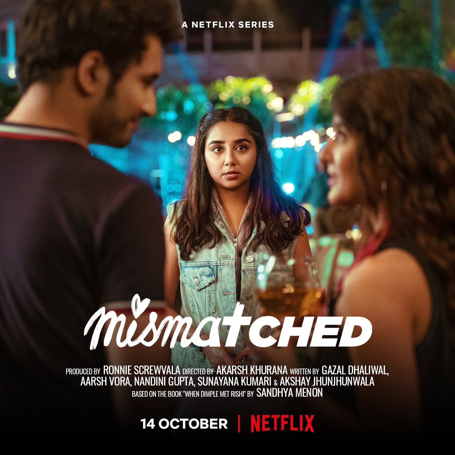
We were tasked with branding Mismatched, a Netflix series starring Prajakta Koli and Rohit Saraf, that has since become the most loved romcom series in India. We designed the show logo, title sequence and various in-show elements that add value while seamlessly blending with the tone of the show.
The logo literally plays with the name ‘mismatched’, clashing incompatible fonts to make a clean and unique show logo that can work across applications.
SHOW LOGO
APPLICATIONS
TITLE SEQUENCE
The title sequence gives a quick recap of the previous season in a short and adorable animated sequence, and then taking us seamlessly into the show’s world of apps and starry eyed dreams, and a quick visual montage hinting at the main elements and characters of the show. The visual style uses bold colors and hand drawn elements to showcase the personal journeys of the characters in this bold new world.
An in-show animated GIF series titled ‘100 REASONS TO HATE DIMPLE’ designed by the character Rishi to follow his dream of being an animator.


